

In today’s fast-paced marketing technology world, professionals and tech enthusiasts are constantly inundated with information. From dashboards to AI-powered insights, the sheer volume of data can be overwhelming. Yet, when given the choice between a dense report and a clear, concise visual, most people naturally gravitate toward the visual. Why? It turns out our brains are wired to process visuals up to 60,000 times faster than text.
Understanding this phenomenon is crucial for marketers, especially those working in the MarTech space. Visuals not only capture attention faster but also improve memory retention, comprehension, and engagement. They help busy professionals quickly extract insights and make decisions without wading through paragraphs of text.
The Science Behind Visual Processing
Humans are highly visual creatures. Nearly half of the brain is involved in visual processing, allowing us to interpret images, charts, and infographics almost instantaneously. This rapid processing speed is why a single well-designed infographic can convey the same information that might take several pages of text to explain.
Visuals also enhance memory. Studies show that people remember up to 80% of what they see, compared with only 20% of what they read. In marketing technology, this means dashboards, charts, and visual summaries are far more effective at leaving a lasting impression than long-form reports.
The Attention Factor
Our attention spans are limited. Research suggests that online readers often engage with only a fraction of the content they encounter. For busy professionals, long reports can feel daunting, leading to skimmed or ignored material. Visuals, on the other hand, are easy to scan and interpret. They reduce cognitive load, making complex data accessible and actionable.
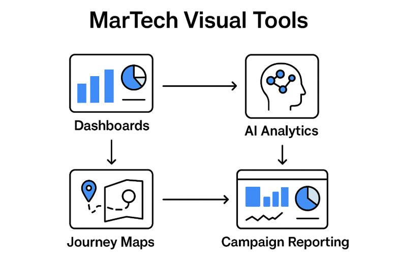
Leveraging Visuals in Marketing Technology
Marketing technology thrives on visuals. Campaign dashboards, data analytics platforms, and AI reporting tools all rely heavily on visual communication. Infographics, charts, and journey maps help professionals grasp patterns, trends, and key insights in seconds.
Visual storytelling also adds clarity and context. For instance, a well-constructed funnel diagram can illustrate customer journeys more effectively than paragraphs of description. Similarly, performance dashboards highlight key metrics instantly, allowing stakeholders to act decisively. McKinsey’s research shows that companies leading in customer experience (CX) achieve up to twice the revenue growth of their peers.
Practical Tips for Effective Visual Communication
- Focus on one message per visual: Avoid clutter to ensure your audience grasps the key point immediately.
- Use data-driven visuals: Accurate charts and graphs build credibility and trust.
- Pair visuals with concise text: Let the image lead, with short captions supporting the message.
- Design for readability: Ensure visuals are clear on both mobile and desktop screens.
- Test retention and engagement: Check if stakeholders remember the key insights to refine future visuals.
- Remember accessibility: While visuals are powerful, ensure alternative text and descriptions for accessibility and broader reach.
By following these guidelines, marketers can create visual content that not only captures attention but also communicates complex information effectively.
Conclusion
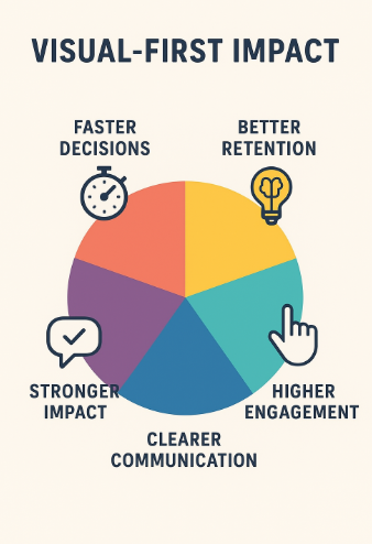
In a world where information overload is the norm, quick visuals are not just a convenience- they are a necessity. They align with how our brains process information, enhance retention, and enable busy professionals to make faster, more informed decisions. For marketers in the MarTech space, embracing a visual-first approach can lead to higher engagement, clearer communication, and stronger impact.
FAQs
Q1: Why do visuals capture attention faster than text?
Visuals are processed by the brain almost instantly, reducing cognitive load and enabling quicker comprehension.
Q2: Can long-form content still be effective?
Yes, especially when paired with visuals that summarize key points for faster understanding.
Q3: What types of visuals work best in MarTech?
Infographics, dashboards, journey maps, and charts that simplify complex data are highly effective.
Q4: How can I balance visuals with informational depth?
Use visuals to convey key insights first, and follow up with concise supporting text for a detailed explanation.
Q5: Are there accessibility considerations for visuals?
Absolutely. Include alt text, descriptive captions, and ensure color contrast to make visuals accessible to all audiences.
Discover the trends shaping tomorrow’s marketing – join the leaders at MarTech Insights today.
For media inquiries, you can write to our MarTech Newsroom at info@intentamplify.com.